Showing posts with label Graphic Design. Show all posts

Monday, January 5, 2015

The One With the Homemade Holiday Gifts

As much as possible, I really love to give handmade gifts. But I also really want to give practical gifts that people enjoy. People not liking the gifts I give them is one of my biggest fears in life. (So if I gave you something you hate, please just regift/donate/toss it without telling me. Or maybe tell me so I can do better next time? Idon'tknowanymore.)

Anyway, last Christmas Henry was the crankiest ever and so I just didn't have much time or ability to put into thoughtful gifts, and it wasn't very fun. I felt bad getting really creative, wonderful gifts and giving a gift card in return. Sad day. This year Henry was more cooperative and I finally felt that I had the time and creative energy to make a lot of the gifts we gave.

I discovered the wonder that is Creative Market, which enabled me to do most of these projects. I got all the elements from various artists there (see source list at bottom of post), and just got to design them in whatever way I wanted.  And it was really fun! I hope the recipients appreciated getting them at least half as much as I enjoyed making them!

Here's a sample of a few things I made this year:

^^ I made these family crests for three couples and paired two of them with one or the other
 of the feather wreathed quotes. I got to see  the first two hung up in Stephanie Stucke's 
adorable New Hampshire apartment and it totally made my day! 

 ^^ I made this initially for my friend Betsy's birthday. Then I made a copy for my mom. 
And one for me, because this is such a good reminder. 

 ^^ I made this for my sister-in-law Emily's birthday. This one is extra special because it 
has the names of each family member printed in the feathers of the arrows. 
I love it. Might need to print one of our family. 

^^ This quote (or possibly collection of quotes?) by Theodore Roosevelt is displayed in the 
foyer of the Museum of Natural History in New York City. I fell in love with it while we 
were there and was so happy to make this print for my son's room. It turned out so well that 
I thought I'd give it to a few other boys I know. 
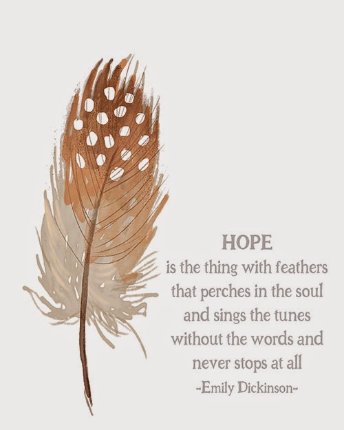
^^ This one went to a friend who loves feathers and brings people a lot of hope. Love you, Jo!

^^Each print was framed up in various ways. I tried to frame them to match any existing decor 
of the person/family to receive them. 

Yay or nay these prints? I'm really loving all this natural/woodsy theme that seems to be popular right now.

If you're interested in a personalized copy of any of these for yourself, contact me! I love to make these things!

Creative Market Design Sources:
Say Less Font // Just Be Cool Font // Watercolor Texture Pack // Watercolor Flower DIY Pack Vol. 2 // Watercolor Wedding Collection One and Two

Friday, May 11, 2012

The One With the Timeline Cover Photos

As you probably know, Facebook made it's official, non-negotiable switch to Timeline recently. This snazzy new get-up includes a cover photo in addition to a profile picture. Well, I may have gotten a bit carried away the other day when I figured out how to make cool cover photos using a Photoshop template...

It all started with the page for my father-in-law, who is running for Commissioner in Skamania County, Washington. I've done the rest of his ads for him (yard signs mostly). But when he added a Facebook page I just couldn't bear for it to look too boring. So I requested admin privileges (got 'em!) and then did a little research to find out the easiest way to create an awesome cover photo. And voila!
Is it the coolest thing ever to be created? Certainly not. But it's an election campaign. We're going for basic and bold here, people. But I do think it turned out well.

A few years ago I also designed the logo for Carson General Store (another enterprise in the Waters' family businesses). I thought it was about time to update their sad-looking little Facebook page. (The sad-looking part is entirely mea culpa.)
I might want to improve this one in the future, but for now, I think it nicely incorporates the logo that I designed way back when.

And so then I couldn't stop there and decided to make my own timeline cover a little extra special. And combine my affinity for instagram. Did you know I only ever use the same filter? You can go ahead and assume I have OCD. I very well might. But! I do think it made the timeline look pretty cool... if I do say so myself:
I definitely like that it allows me to showcase more of my favorite instagrams.

And since I still had the cover photo bug (what the heck is wrong with me?), I decided not only to create a cover photo for this blog, but a whole Facebook page as well! (And just my luck, Facebook is going to nix the timeline in about 3.5 hours...)
So, now you can like The One With the Cupcakes on Facebook to get updates about posts and such on your news feed. Just think of all the time you'll save coming straight to the blog! It will be so much easier for you to show posts to your friends! And to think that if I hadn't discovered timeline covers you might have to do that anyway.

And if you're interested in creating your own unique timeline cover photo, here's how:
  • Cover photos are 851 x 315 pixels, so open up a file that size in Photoshop and be on your way
  • Check out these AWESOME cover photos people have made. Talk about cool...
  • At the bottom of the article linked above you can find a template for Photoshop that shows you exactly how the cover photo and profile picture interact so you can download it to make sure your picture and cover are aligned correctly if you plan on incorporating the two. Saves a lot of time instead of you having to upload a bunch of trials and errors. 
If you use this info to make your own awesome Facebook timeline, I'd love for you to show me a link. As you can see, I'm mildly obssesed with these today.

Wednesday, December 14, 2011

The One With the Christmas Cards

Well... Christmas is like next weekend. O my! How did it sneak up on us so quickly?!?! Anyway... it's past time to have made the Christmas card. So yesterday I made a few. Now, I love all of these, of course. And it was super hard to choose which one went to print. I let Steve have all power in that department. Seems only fair since I made them all. This one is my very favorite... but not Steve's. So it didn't get printed. But I still love it.
 This one is very similar to the one that did go to print. But just in case any of your are on our Christmas card list, I chose not to reveal the actual copy. 
And these last two are just fun and casual. I like them, too. I also like that the picture is more goofy - but shows off the girls' personalities better.
That last one looks a little familiar, maybe? I did a similar font style on Cyril and Liam's (see the end of that post).  And if you're interested, here's a link to last year's Christmas card designs.

Thursday, October 6, 2011

The One With the Birthday Party Invitations

I realized I forgot to show you the party invitations for Mallory and Ellie's birthday party.
I designed them myself and sent them in bright pink envelopes. Pretty straightforward, but also fun. And I'm in love with the font I used. You'll probably see it around a bit more.

Friday, August 12, 2011

The One With Jake's Silhouette

 I love silhouette art. It's so clean and classy.

My friend, Betsy, asked me about doing a silhouette of her son, Jake (Ellie's BFF). I was happy to try again. I hadn't done once since Ellie's, but now I'm hooked and want to do many more. Look how well it turned out! I started with this picture, plus another profile picture that showed me the back of his head:

And ended up with this:
Cool, huh? These silhouettes are rendered by me and then hand-cut and assembled with the name and background of your choice and is available in in my Etsy shop. All I need from you is a profile picture of your child! Email me if you want to get started now!

Thursday, August 11, 2011

The One With the Big Things


I love this quote by Robert Brault. And I think quotes turned into carnival tickets are pretty awesome, too. So I combined the two and voila! I even made it into a free printable for you! There are four different color combinations for the tickets. Use the big ones for greeting cards or simple notes, or use the small ones the next time you need tickets for a drawing.

4 Large Tickets, click here.
12 Small Tickets, click here.

Friday, August 5, 2011

The One With Liam's Birth Announcement

I know you've seen a lot of this little guy lately, but I had to share one last project revolving around his arrival: birth announcements I designed! This design is available in my Etsy shop. You can always contact me directly for orders until then!

Printed as 5x7s and available in black-and-white:
Or in partial or full color:
Of course, color scheme can be changed for girls (see Olivia's here) or customized!

Tuesday, March 22, 2011

The One With Olivia's Birth Announcement

I ordered Olivia's birth announcements today to celebrate her 3 week birthday. My oh my, how time flies when you're having fun (and feeding babies and changing a lot of diapers).

I ordered them through the site Uprinting.com. Not that I'm an expert or anything, but I've been around a very small version of the block with printing companies and would have to say that since finding Uprinting, I've never looked back. I have used them for ordering business cards and holiday cards. They are great for big and small projects and offer a free proof to make sure that your product is printed correctly. Their customer service is excellent and I think their work is top notch. So if you need an online printer recommended, now you have one.

Saturday, November 13, 2010

Dreaming of Christmas Cards...

It's that time of year again and I've been thinking about how I want to do our family Christmas cards this year.

This one is pretty sweet. And I like the snowy version below even better.


And although I'm a fan of this one, Steve says it isn't wintery enough. I guess that's what you get for living in Portland where there is no snow. We'll have to dress Ellie up in some winter gear and at least pretend there is snow for a photo shoot before these go to print.

And another one... mostly because I lack pictures of other babies to put in the template.


And then I just started playing around and making some for friends...


This is one I did last year to announce the birth of my nephew.

And this design was our Christmas card last year. I just updated it for fun.


So here's the thing: I want to continue to build my portfolio and would love to make YOUR family's holiday cards! That's right! I'm giving away 10 FREE holiday card designs. You would be responsible for all printing, etc. I would just be making the design. Really, seriously. You will be able to choose any of the designs above or get a whole new one if you give me some ideas of what you're hoping for.
To win one of the FREE designs, comment on this post or email me and we'll get something started!

Wishing you a happy holiday season,
Michelle

Sunday, September 26, 2010

The One With the Rall Family Photos

My sister-in-law came to visit with her hubby and baby girl. They asked me to take some pictures for their Christmas card this year. Here are the results.

I actually took these at a party celebrating Carly's baptism, but I just love the sentiment.


Cute as a little button!

In this one, Carly was smiling really big because her dad came over to entertain her. I love how much she loves him!


And the whole family!
And here is the Christmas card I put together for them.

Monday, September 20, 2010

The One with the Signs for Amity

Recently I was hired to hand paint some signs for a grocery story in Amity, Oregon, called Amity Foods. I basically repeated the same process as with the Carson General Store sign, only this project was much bigger. I painted 8 eight-foot signs in black and white with a burgundy border. It took a long time and the black paint was difficult to make even.

To begin, the boards were primed and painted white. Then, after projecting the image and tracing the letters, I did the first round of outlining in black paint.

This part made me feel like a real artist because it reminded me of Michaelangelo's quote when asked about the statue of David, "How do you take a rough stone and make such beauty from it?" to which he replied, "I just carve away anything that isn't art." This project made me feel like I was carving away everything that wasn't the letters of the signs. Silly, I know, but it got me through the very long process.


It took a few more rounds of touch-ups with white and black paint alternatively to perfect the signs. And finally I added a burgundy border. And here's a shot of what all the signs looked like lined up and waiting to be picked up by the owners of the Amity store.


Sorry about the glare, the black paint was very shiny. One of these days I'm hoping to drop by the store and get pictures of them actually mounted. Until then, you'll just have to get the idea from the lineup above.

Saturday, July 31, 2010

Carson General Store Branding

Branding of Carson General Store is finally complete!


T-shirts were printed at customink.com. I highly recommend them! Not only are their American Apparel t-shirts so soft and comfy, their customer service is A-MAZING. And their online chat tool is also great!

The One With Carson General's Sign

The Carson General Store sign is finally done! It was a very long project - but the result is pretty cool. And here's a little insight into the how-to.

Step 1: We mounted the plywood on a wall to make the painting easier. Painted the plywood white and used a projector and transparency to project the image onto the plywood. Next, we outlined the design on the plywood with a Sharpie. In retrospect, I would use something a little easier to paint over. It turns out that Sharpie is rather difficult to cover.


Step 2: Painting in the color. Since the sign is going to be outside, we used exterior paint. It was color matched at Home Depot. Exterior paint is difficult to work with - but worth it for the end result. This is me painting - one of the final steps was outlining the mountains with charcoal colored paint.

Getting all the long lines of the lettering straight proved to be quite a challenge. I ended up edging almost every part of every letter with painter's tape. It took a long time - but was well worth the ease of painting such long strokes against the grain of the wood.

A close up of the final product before we had dismounted the plywood. After it was dismounted, we used a skill saw to cut out the half-oval over the top of the mountains.

And this is what it currently looks like mounted above the store. I wish that the pulleys in the front weren't there... but apparently it was a necessity. In the Columbia River Gorge there are a lot of big wind gusts - gusts strong enough to take the sign off and into something valuable. So, until we figure out a new way of securing the sign, the pulleys stay.

Related Posts Plugin for WordPress, Blogger...